

Designing your own DTF transfers. Sounds simple, isn’t it? Open a tool, create a design, print it. Done. But that’s not quite the way you think it is.
If you’ve ever tried and ended up with blurry prints, weird colors, or a background that shouldn’t exist—you already know something’s off. The truth is, when it comes to learning how to design your own DTF transfers, it’s not just about creativity, but precision matters too.
So, here’s the answer:
To create DTF designs, you need a high-resolution file (300 DPI), transparent background, correct color settings, and export it in a print-ready format like PNG. Doing it correctly is essential to create quality custom DTF transfers that you can use for tees, hoodies, and other apparel.
If you really want to create high-quality design for DTF transfers that will yield excellent results, this guide is for you. You’ll learn how to make your own DTF transfers, avoid common mistakes, and understand how to design files that actually print the way you expect—not just look good on screen.
What is DTF Design? (Quick Clarity Before You Start)
A DTF design isn’t just a graphic—it’s a print-ready digital file created specifically for transfer printing. When you create DTF designs, you’re not designing for screens; you’re designing for fabric.
Here’s the key difference:
What you design is exactly what gets printed. No auto-corrections. No adjustments later.
A proper DTF design includes:
-
High resolution (300 DPI for sharp output)
-
Transparent background (no unwanted boxes)
-
Clean edges (no rough pixels or halos)
-
Accurate color setup (so prints match your design)
Think of it like this—DTF printing is brutally honest. If your file has flaws, they will show up on the garment.
So before you jump into how to design DTF transfers,
understand this: A great design isn’t just about creativity. It’s about making sure your file is built for printing, not just viewing.
Why Most DTF Designs Fail (Before They Even Get Printed)
Here is the cold, hard truth: Most people don't fail at the heat press. They fail at the computer.
You can spend hours crafting a masterpiece that looks flawless on your monitor. Sharp edges. Glowing colors. A layout that pops. It feels like a winner. Then, you print your own DTF transfers and hit the fabric. Suddenly, reality sets in. Blurry lines. Dull tones. Strange white halos where they don't belong. That is where the frustration starts.
DTF printing is brutally literal. It is a mirror, not a filter. It won’t fix your mistakes or "enhance" a weak file. It prints exactly what you give it—flaws and all.
Most "printing" failures are actually file preparation failures.
-
The Resolution Trap: Your design looks "clean" on a 6 inch phone screen. But when you scale it for a hoodie, the pixels stretch. Clarity dies. Text turns into a fuzzy mess.
-
Dirty Transparencies: This is the big one. If your background isn't 100% gone, the printer will find it. You’ll end up with a faint, ugly box around your art. It looks amateur.
-
Color Translation Errors: Screens use RGB (light). Printers use CMYK (ink). If you don't manage these settings, your neon electric blue will come out looking like muddy denim.
-
Jagged Edges and Halos: Poor cutouts create "stair-stepping." These rough edges lead to those thin, annoying white outlines that ruin the professional "melted-into-the-shirt" look.
-
Compression Death: Heavy compression kills details. It destroys gradients and fine textures. Your shadows will look blocky and cheap.
-
The Format Mistake: Never use a JPG. It deletes your transparency and forces a background. Use PNG or TIFF. Always.
If you are serious about mastering DTF transfers, start with the file. You cannot fix a broken foundation. Once the file is flawed, the print is already a ghost. Invest time in the design stage, or you're just wasting expensive film.
Related: How to Prepare Image for DTF Printing? An Expert’s Guide
Tools You Can Use to Create DTF Designs
Before you start designing, you need the right tools. Not expensive ones—just the right ones.
The good news? You don’t need a complex setup to create DTF designs. What matters is control over resolution, transparency, and export quality. That’s it.
Here are the most commonly used tools—each with its own strengths:
-
Adobe Photoshop: This is the industry standard. It gives you full control over layers, resolution (300 DPI), and background removal. If you’re serious about learning how to design DTF transfers at a professional level, Photoshop is hard to beat.
-
Adobe Illustrator: Best for vector-based designs like logos, typography, and clean graphics. It allows you to scale designs without losing quality—perfect for print consistency.
-
Canva: Beginner-friendly and surprisingly capable. You can design quickly, remove backgrounds, and export PNG files with transparency. Great for simple designs and fast workflows.
-
CorelDRAW: Popular in print shops. Strong vector capabilities and widely used in production environments.
Here’s the key insight:
The tool doesn’t matter as much as how you use it. You can create a perfect design in Canva—or a terrible one in Photoshop. The difference comes down to whether you understand print requirements.
So choose a tool that fits your skill level. Then focus on mastering the fundamentals—resolution, transparency, and clean design output. That’s what actually makes your DTF designs work.
How to Design Your Own DTF Transfers (Step-by-Step)
Now for the part you actually came for: how to design your own DTF transfers that print clean, sharp, and professional. We aren't just looking for "screen-pretty." We need production-ready.
Step 1: Set Your Canvas Correctly
Start with the right foundation. Beginners skip this and regret it. Set your canvas size based on the final placement—chest, back, or sleeve. Most importantly, set your resolution to 300 DPI from the jump. You cannot "upscale" it later. It doesn't work.
-
Standard chest design: 10–12 inches wide
-
Full back design: 12–14 inches wide
If you start with a low resolution, your print will be blurry. No exceptions.
Step 2: Create Your Design (Keep It Print-Friendly)
Now for the creative part. But remember: DTF has rules. You have to think beyond the visuals. Avoid razor-thin lines or tiny details that might not "grab" the adhesive powder.
-
Use bold, clear elements
-
Maintain high contrast
-
Keep spacing clean
Note: Simplicity usually wins. What looks intricate on a monitor often disappears into the weave of the fabric.
Step 3: Remove Background Properly
This is the make-or-break step. Your design needs a fully transparent background. Not "mostly clean." Surgically clean. Even a pixel-wide stray edge will show up as a visible box or a "halo" outline on the shirt.
-
Use professional background removal tools
-
Zoom in and scrub edges manually
-
Check against a high-contrast background to spot "ghost" pixels
Note: This step alone separates the amateurs from the pros. If you aren't sure, check out our guide on how to remove the background for DTF transfer printing.
Step 4: Check Colors and Contrast
DTF workflows are usually RGB, but the ink reality is different. Ensure your colors are punchy. Low-contrast designs often look flat and muddy once they hit the garment.
-
Avoid faint colors on light-colored shirts
-
Bump up the contrast for better "pop"
-
Always design with the final garment color in mind
Step 5: Export in the Right Format
The home stretch. Export your design as a high-quality PNG with transparency. Avoid JPG like the plague—it kills your transparency and crushes your quality.
-
Format: PNG
-
Resolution: 300 DPI
-
Background: Transparent
-
Compression: Minimal
Note: This is your "source of truth." What you export is exactly what hits the film.
Step 6: Double-Check Before Printing
Before you commit to DTF design printing, do a final "quality audit." It takes 30 seconds. It saves you from wasting expensive film and ruined shirts.
-
Zoom to 300% to inspect edges
-
Flip the design onto different color backgrounds
-
Scan for "noise" or hidden artifacts
If you follow these steps, you won't just be making art. You'll be creating high-performance DTF transfers that actually work in the real world.
Note: A 30-second check can save you from wasting shirts, time, and money.
File Settings for DTF Printing (This Is Where Most People Mess Up)
You can design everything perfectly—but if your file settings are wrong, your print will still fail. This is where most people struggle when learning how to design DTF transfers.
DTF printing doesn’t “fix” your file. It prints exactly what you give it. So your export settings need to be clean, intentional, and consistent—especially if you’re working with gang sheet printing, where one mistake can affect multiple designs at once.
1. PNG vs JPG — Always Choose PNG
This is non-negotiable.
-
PNG: Supports transparency, keeps edges clean
-
JPG: Adds background, reduces quality
If you export as JPG, your transparent background turns into a solid block. That means your design prints with an unwanted box around it. Always use PNG to get reliable results after printing your DTF design.
2. Maintain High Image Quality
Even if your design looks sharp on screen, poor quality settings will show up in print.
-
Low-quality files = blurry edges and lost detail
-
High-quality files = crisp, professional output
Start with a high-quality canvas and avoid resizing too much later.
3. Transparent Background (100% Clean)
This is where most designs fail. Even tiny leftover pixels or soft edges will show up after printing. What looks invisible on screen becomes obvious on fabric—especially when pressing multiple designs in a single layout.
-
Zoom in and inspect edges carefully
-
Test your design on dark and light backgrounds
-
Remove all unwanted pixels
Clean edges are critical for professional results.
4. Color Mode (RGB for Best Results)
Most DTF workflows are optimized for RGB.
-
RGB delivers better vibrancy
-
Helps maintain accurate color output during printing
Still, always design with strong contrast to avoid dull-looking prints.
5. File Size and Compression
Avoid compressing your file too much.
-
Over-compression removes fine details
-
Gradients and shadows lose depth
Keep your file quality high—even if it increases file size slightly.
6. Final Pre-Print Checklist
Before heading to DTF printing there are some quickly checkups you should perform to ensure best quality output:
-
PNG format
-
Background fully transparent
-
Edges clean and sharp
-
Colors strong and visible
-
No compression artifacts
This step may seem small—but it’s where consistency is built.
Because in DTF, your file isn’t just a design.
It’s the exact blueprint of what gets printed—especially when scaling with gang sheets or bulk production.
Related: What is the Best File Type for DTF Printing?
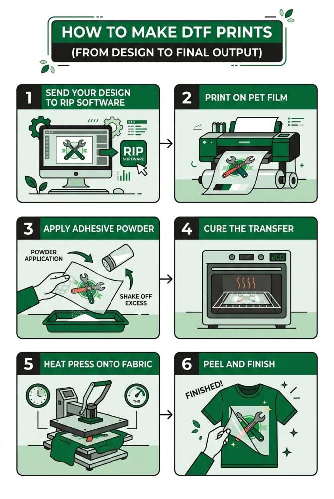
How to Make DTF Prints (From Design to Final Output)
Now that your design is ready, the next step is turning it into an actual print. This is where many people get confused—because designing and printing are two different stages.
When you make your own DTF transfers, your file goes through a structured process before it ever touches fabric.
Step 1: Send Your Design to RIP Software
Before printing, your file is processed through RIP (Raster Image Processor) software. This software prepares your design for DTF printing by separating colors and adding a white underbase layer.
-
Controls ink distribution (CMYK + White)
-
Adjusts color output for fabric
-
Prepares layering for transfer
This step ensures your design prints accurately and remains visible on all fabric types.
Step 2: Print on PET Film
Once processed, your design is printed onto a special PET transfer film—not directly onto fabric.
-
Design is printed in reverse (mirror image)
-
White ink is applied as a base layer
-
High-detail output is transferred onto film
This is what makes DTF different from direct printing methods.
Step 3: Apply Adhesive Powder
After printing, a layer of adhesive powder is applied to the wet ink.
-
Acts as the bonding agent
-
Ensures the design sticks to fabric during heat pressing
-
Must be evenly distributed
Uneven powder = uneven adhesion = poor durability.
Step 4: Cure the Transfer
The powdered film is then cured using heat to activate the adhesive.
-
Turns powder into a sticky bonding layer
-
Prepares the transfer for pressing
-
Can be done using a curing oven or heat press
This step locks the design into a transferable format.
Step 5: Heat Press onto Fabric
Now comes the final application step. The transfer is placed onto the garment and pressed using heat and pressure.
-
Position design correctly
-
Apply consistent pressure
-
Follow correct time and temperature
This is where your design becomes a finished product.
Step 6: Peel and Finish
After pressing, the film is peeled (hot or cold depending on type), followed by a second press for finishing.
-
Removes carrier film
-
Seals edges
-
Improves durability and feel
This final step enhances both look and longevity. If your design file is perfect, this process works smoothly. If not, every flaw becomes visible here.
Standard DTF vs UV DTF
When comparing Standard DTF and UV DTF, the biggest difference lies in where and how the design is applied. While both methods use transfer-based techniques, they are built for entirely different applications and outcomes.
Standard DTF (Direct to Film) is primarily used for textile printing. The design is printed onto a film, coated with adhesive powder, cured, and then heat-pressed onto fabric. This allows the ink to bond with the garment, resulting in a flexible, stretchable print that moves with the fabric—making it ideal for apparel like t-shirts, hoodies, and uniforms where comfort and durability matter.
UV DTF, on the other hand, is designed for hard, non-porous surfaces such as glass, plastic, metal, and wood. Instead of heat, it uses UV-cured inks and an adhesive layer to transfer designs through a simple peel-and-stick process, creating a rigid, glossy finish.
Key differences at a glance:
-
Application: Fabric (DTF) vs Hard surfaces (UV DTF)
-
Process: Heat press vs Peel-and-stick
-
Finish: Flexible and soft vs Rigid and glossy
-
Detail Output: Fabric-influenced vs Highly precise
From a design perspective, Standard DTF requires you to account for fabric behavior like stretch and absorption, while UV DTF delivers sharper, more exact results since there’s no fabric interaction.
Overall, Standard DTF is best for wearable products, while UV DTF is ideal for product customization and surface branding.
When to Use UV DTF Printing
UV DTF becomes the right choice when your focus moves beyond clothing and into product customization and branding on solid surfaces.
Here’s when it makes the most sense:
-
You’re customizing non-fabric items: Perfect for glass bottles, mugs, phone cases, packaging, acrylic boards, and more.
-
You want a no-heat application process: No heat press required. Just peel, apply, and stick—ideal for quick production setups.
-
You need high-detail, sharp designs: UV DTF captures fine lines, small text, and intricate artwork better since there’s no fabric absorption.
-
You’re expanding your product range: Great for businesses moving into promotional items, corporate gifting, or branded merchandise.
-
You want premium-looking finishes: UV prints often have a glossy, raised, almost embossed feel—perfect for high-end branding.
In real-world terms, if you’re printing apparel—stick with standard DTF. But if you’re customizing products people use daily, UV DTF opens up an entirely new revenue stream.
Designing for Production (Where Most Beginners Struggle)
Designing a DTF transfer is one thing. Designing it for real production? That’s a different game.
This is where most people hit problems—especially when they move from single designs to gang sheet printing or bulk orders. What worked for one shirt suddenly starts failing across 50.
Key Things to Consider for Production
-
Consistent Sizing: Keep your designs proportionate. Random scaling leads to inconsistent prints across garments.
-
Spacing for Gang Sheets: When placing multiple designs together, leave enough space between them. Too close, and cutting or pressing becomes messy.
-
Uniform File Settings: Mixing different quality files in one sheet creates uneven results. Keep everything standardized.
-
Alignment and Layout: Poor alignment leads to wasted material and off-center prints—especially noticeable in bulk order printing.
Real-World Scenario
Let’s say you’re printing for a small clothing brand. You create 10 different designs and place them into a gang sheet. Everything looks fine on screen. But after printing:
-
Some designs look sharper than others
-
Spacing is uneven
-
Cutting becomes difficult
That’s not a printing issue. That’s a production design issue.
Common Mistakes to Avoid When Designing DTF Transfers
By now, you know how to design your own DTF transfers. But here’s the truth—most bad prints don’t come from lack of effort. They come from small, avoidable mistakes. And these mistakes? They show up fast. Especially when you move into real orders.
1. Designing Only for Screen, Not for Print
This is the biggest one. Your design may look perfect on your laptop or phone. Bright. Sharp. Clean. But screens lie. Fabric doesn’t. Always think about how the design will look on an actual garment—not just on a digital canvas.
2. Ignoring Background Cleanup
You removed the background… or at least you think you did. But when printed, there’s a faint box. Or rough edges. Or a halo around the design. Even tiny leftover pixels will show up. Always zoom in and double-check.
3. Overcomplicating the Design
Too many effects. Too many gradients. Too much going on. DTF can handle detail—but that doesn’t mean it should. Overly complex designs often lose clarity when transferred to fabric. Clean, bold, and readable designs almost always perform better.
4. Poor Color Contrast
Designing light colors on light garments. Or dark on dark. It may look stylish on screen—but in real life, it disappears. Always test your design against the actual garment color.
5. Inconsistent Files in Bulk Workflows
This becomes a major issue in gang sheet printing or bulk production.
-
Different file qualities
-
Different sizes
-
Different edge finishes
The result? Inconsistent prints across the same order.
6. Skipping Final Checks
You export the file and move on. No review. No testing. That’s where errors slip through.
Always do a final check:
-
Edges clean?
-
Background transparent?
-
Colors visible?
Related: 15 Common Direct to Film Transfer Mistakes & How to Avoid Them
In a Nutshell
Designing your own DTF transfers isn’t just about creativity—it’s about control. From file setup to final output, every step matters. When you understand how to design DTF transfers properly, you avoid costly mistakes, wasted prints, and inconsistent results.
Whether you’re creating a single design or scaling with gang sheet printing, the goal is the same: clean files, sharp output, and reliable production. Get the basics right. Stay consistent. Think beyond the screen. Because in DTF, what you design is exactly what you deliver.
FAQs
What is the best file format for DTF designs?
PNG is the best format because it supports transparency and maintains high image quality for clean prints.
Can I create DTF designs using free tools?
Yes, tools like Canva can be used to create DTF designs, as long as you export the file correctly with proper settings.
3. Why does my DTF print look blurry?
This usually happens due to low image quality, resizing issues, or exporting files with compression.
4. Do I need to mirror my design before printing?
Yes, designs are typically mirrored before printing on film so they appear correctly when transferred onto fabric.
5. What is gang sheet printing in DTF?
Gang sheet printing is the process of placing multiple designs on a single sheet to maximize space, reduce costs, and improve production efficiency.