

DTF printing has changed how custom apparel gets made. Faster. More flexible. But here’s the catch—great prints don’t start at the printer. They start with the file.
One bad file equals a wasted print. Blurry outputs. Rough edges. Colors that don’t match expectations. It happens more often than people admit. And most of the time, the issue isn’t the machine—it’s how you prepare art for DTF.
If you don’t understand how to create a DTF design properly, even the best setup won’t save your results.
In this blog, we’ll break down exactly how to prepare your images the right way—step by step—so your prints come out sharp, vibrant, and production-ready every time.
Why Image Preparation Matters in DTF Printing
Image preparation is where print quality is actually decided. Not at the printer. Not during pressing. Right here.
If you don’t properly create a DTF image, everything downstream suffers. Colors look off. Edges turn rough. Fine details disappear. Even durability drops because the ink doesn’t bond well to poorly prepared artwork.
It also plays a critical role in underbase accuracy. In DTF, the white layer is generated directly from your design. So if your file has soft edges or transparency issues, the underbase becomes uneven—one of the most common mistakes when learning how to create a DTF design.
What Poor Image Preparation Leads To:
-
Dull or faded colors
-
Pixelated or blurry prints
-
Rough, jagged edges
-
Weak adhesion and reduced durability
What Proper Image Preparation Ensures:
-
Sharp, clean edges
-
Vibrant and accurate colors
-
Strong underbase alignment
-
Consistent, professional results
Let’s make it real.
A low-resolution logo printed as-is looks blurry and cheap. Now take the same file—cleaned, sharpened, optimized—and print it again. The difference is obvious.
That’s why understanding how to make DTF transfers always starts with the file.
Read more: Direct to Film Transfer Design Tips
Ideal File Requirements for DTF Printing
Getting the file right is the foundation of how to prepare image for DTF printing. Without proper setup, even the best printer won’t deliver quality results.
Let’s start with formats. Not all files are equal.
Recommended File Formats:
-
PNG (most preferred for transparency)
-
PSD (for layered editing)
-
AI (vector designs)
-
PDF (print-ready files)
PNG is widely used when creating DTF transfers, especially for transparent backgrounds.
The file resolution is non-negotiable. Always work at 300 DPI. Anything lower leads to blurry prints, especially when scaling designs.
Background matters more than you think. A transparent background ensures clean edges and avoids unwanted boxes or color patches during printing. This is critical when learning how to create a DTF design.
Color Mode: RGB vs CMYK
-
RGB is preferred for DTF workflows
-
It offers brighter, more vibrant colors
-
RIP software later converts it for printing
If you’re working on layouts for gang sheet printing, consistency across all files is key. One poorly prepared design can affect the entire sheet.
Get these basics right—and your prints start strong.
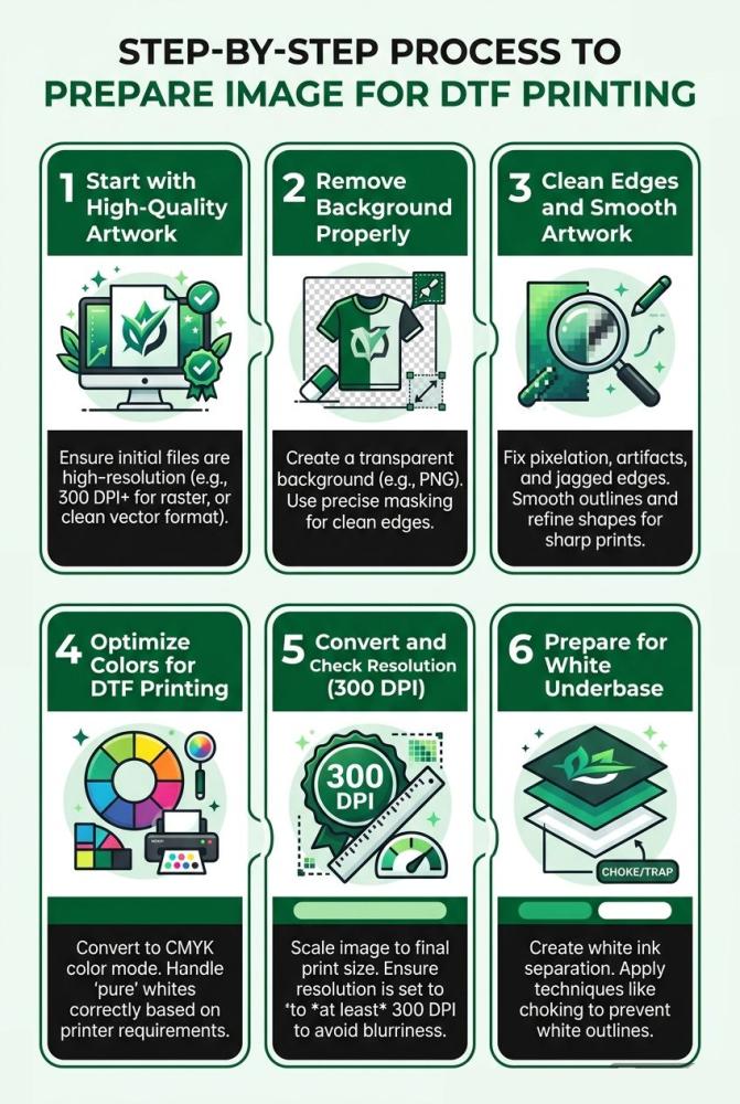
Step-by-Step Process to Prepare Image for DTF Printing
This is where things get real. If you want consistent results, you need a clear process. Not guesswork. Whether you're learning how to make DTF transfers or scaling production, these steps matter.
Start with High-Quality Artwork
Everything begins with the source file.
Low-resolution images are the fastest way to ruin a print. They look fine on screen. But once printed, they turn blurry and pixelated.
Avoid:
-
Images below 300 DPI
-
Screenshots or compressed files
Also, don’t rely on upscaling tools. Increasing size doesn’t add real detail—it just stretches pixels.
If you’re serious about how to create a DTF design, always start with the best quality file available.
Remove Background Properly
Background removal isn’t just about deleting a color. It’s about precision.
A poor cut leaves behind:
-
White halos
-
Shadow remnants
-
Rough outlines
These flaws show up clearly when you prepare art for DTF.
Make sure:
-
The background is fully transparent
-
Edges are clean and defined
-
No leftover pixels remain
Clean transparency = clean prints.
Clean Edges and Smooth Artwork
Edges define how professional your print looks.
Use anti-aliasing to smooth transitions between colors. Refine edges so they don’t appear jagged or broken.
Focus on:
-
Smoothing curves and corners
-
Removing noise or artifacts
-
Sharpening fine details
When people ask how do you make DTF transfers look premium—this is one of the biggest factors.
Optimize Colors for DTF Printing
Colors on screen don’t always match printed output.
DTF prints tend to slightly darken designs, especially on darker garments.
So adjust before printing:
-
Increase brightness slightly
-
Boost contrast where needed
-
Avoid overly dark tones
Balanced colors ensure your final print looks vibrant, not dull.
Convert and Check Resolution (300 DPI)
Resolution isn’t optional. It’s critical.
Always set your file to 300 DPI at actual print size. Not before. Not after resizing.
Key things to remember:
-
Maintain aspect ratio while resizing
-
Don’t stretch images
-
Check dimensions before exporting
This step is essential in both how to print DTF and maintaining consistency across designs.
Prepare for White Underbase
This is where many designs fail.
DTF uses a white base layer beneath your artwork. If your file has semi-transparent pixels, the underbase becomes uneven.
Avoid:
-
Soft transparency in key areas
-
Faded edges
-
Low-opacity elements
Instead:
-
Use solid colors where needed
-
Keep edges well-defined
-
Ensure the design is underbase-ready
The better your file, the cleaner the white layer—and the better your final print.
Key Takeaways Table
|
Factor |
What to Do |
Why It Matters |
|
Resolution |
Use 300 DPI |
Sharp prints |
|
Background |
Keep transparent |
Clean transfers |
|
Colors |
Optimize brightness |
Better vibrancy |
|
Edges |
Smooth & refine |
Professional finish |
|
File Type |
Use PNG/PSD |
Better compatibility |
Common Mistakes to Avoid in Preparing Art for DTF
Even small mistakes in file preparation can ruin your final print. Most issues people face while learning how do you make DTF transfers come down to poor image setup—not the printer.
Let’s break down the most common ones.
Using Low-Resolution Images
This is the biggest mistake. Low-quality images might look fine on screen, but once printed, they appear blurry and pixelated. If you want to create a DTF image that looks professional, always start with high-resolution files.
Ignoring Transparency Issues
Bad background removal leads to visible halos, shadows, or unwanted outlines. When you prepare art for DTF, every leftover pixel shows up in the final print—especially in bulk DTF printing, where one flawed file can affect multiple outputs.
Over-Complex Gradients
DTF can handle gradients, but overly complex ones often create banding or uneven color transitions. Simplifying gradients helps maintain clarity and improves print consistency.
Not Checking Print Size
Designing without considering actual print size leads to distortion or loss of detail. Always set dimensions correctly before exporting to avoid resizing issues later.
Exporting in the Wrong Format
Using formats like JPG can ruin transparency and reduce quality. Stick to PNG, PSD, or vector formats to maintain clean edges and proper file integrity.
Avoid these mistakes, and your prints instantly improve.
Read more: Common Direct to Film Transfer Mistakes
Tools You Can Use for Image Preparation
The right tools make it much easier to prepare art for DTF printing and avoid common design issues. You don’t need everything—just the right fit for your workflow.
-
Photoshop: Ideal for raster designs. Great for background removal, edge cleanup, and color correction when learning how to create a DTF design.
-
Illustrator: Best for vector graphics. Helps create scalable, sharp designs without losing quality.
-
Canva (for beginners): Simple and easy to use. Good for basic layouts, but limited control over advanced DTF requirements.
-
RIP Software Preview Tools: Essential for checking how your design will print, especially underbase and color layers before production.
Using the right combination ensures cleaner files and better prints.
Tips for Better DTF Image Quality
Getting consistent, high-quality prints isn’t just about following steps—it’s about refining your process. Small habits make a big difference when you prepare art for DTF.
Always Zoom to 100% Before Exporting
Never trust how your design looks when zoomed out. At 100%, you’ll catch pixelation, rough edges, or hidden flaws. This step is critical when you create a DTF image that needs to look sharp in print.
Test Print Small Samples
Before running full production, print a small sample. It helps you check colors, edges, and overall quality. This is especially useful when experimenting with new designs or learning how to create a DTF design.
Save Layered Files
Always keep editable versions (PSD, AI). If changes are needed later, you won’t have to start from scratch. This saves time and keeps your workflow flexible.
Use Consistent Export Settings
Stick to the same resolution (300 DPI), file format, and color settings. Consistency ensures predictable results, especially when handling repeat or bulk orders.
These simple practices help you avoid costly mistakes and maintain professional-quality prints every time.
Real-World Scenarios for Preparing DTF Design
Scenario 1: Customer Logo with Low Resolution
A client sends a logo pulled from a website. It looks fine on screen but breaks when printed. Edges appear jagged. Colors look washed out. This is common when you don’t properly prepare art for DTF. The fix? Recreate or vectorize the file before printing.
Scenario 2: Dark Design on Black Shirt
A design with deep tones is printed on a black garment. Without proper adjustments, the print looks dull and lifeless. When you create a DTF image, brightness and contrast must be optimized. The white underbase also needs careful handling to make colors stand out.
Scenario 3: Bulk Orders with Inconsistent Files
In bulk DTF printing, different file qualities cause inconsistent outputs. Some prints look sharp, others don’t. Standardizing how you prepare art for DTF ensures every transfer looks consistent and professional.
FAQs
1. What is the best file format for DTF printing?
PNG with a transparent background is ideal for creating DTF transfers.
2. What resolution is required to prepare art for DTF?
300 DPI is the standard for sharp, high-quality prints.
3. Why does my DTF print look blurry?
Low-resolution files or improper scaling often cause blurry prints.
4. How do you make DTF transfers with accurate colors?
Optimize brightness, contrast, and avoid overly dark tones during design preparation.
5. Can I use JPEG files for DTF printing?
Not recommended, as JPEGs lack transparency and may reduce print quality.
6. Why is background removal important in DTF?
Clean transparency prevents unwanted edges, halos, and poor print finish.