


White-on-white apparel is everywhere right now. High-end streetwear brands love this clean, minimalist style. It looks premium and subtle.
But making it happen is tough. In fact, white on white DTF printing is way harder than standard color printing. Why? Because getting a white design to actually pop against an identical white background takes absolute precision. If you get it wrong, your design completely disappears into the shirt.
This white ink DTF transfer guide solves that exact problem. We will show you how to tweak your artwork files for high contrast. You will also learn the exact press settings needed for flawless DTF printing on white fabric. Let's fix your setup and make your subtle prints stand out with quality DTF transfers.
What Is White-on-White DTF Printing?
White-on-white DTF printing is a technique where white ink transfers are applied to white garments to create subtle, tonal designs using texture, gloss, opacity, or layering differences instead of strong color contrast.
It is often called monochrome DTF printing. In standard jobs, you use color to make a design pop. Here, you use depth. It is a "tonal" concept. Think of it like a watermark on a premium business card. The design is there, but you have to catch the light to see it perfectly.
How is it different? Standard printing relies on a white underbase to make colors bright. In white on white DTF printing, the underbase and the top layer are the same. This makes DTF printing on white fabric a game of shadows and thickness.
You aren't just printing a logo; you are adding a physical layer to the shirt. Mastering these DTF white ink printing techniques is the key to that high-end, ghost-print look.
Why Printing White on White Fabric Is Challenging
Printing a bright red logo on a white shirt is easy. Printing white ink on that same shirt is a battle. When you mix the same shades, your design faces unique physical limitations. Here is why white DTF disappears on white shirts.
Lack of Visual Contrast
Human eyes need contrast to see shapes. Standard printing relies on color differences. When you print white on white, that color gap drops to zero. You lose the traditional boundaries that make a logo pop. The design must rely entirely on edge shadows and light reflection to be visible.
White Ink Blending into Fabric
Liquid ink changes when pressed. During the heat press cycle, the white ink is pushed down into the cotton or polyester threads. On a colored shirt, this ensures the ink looks solid. On a white shirt, the garment fibers bleed through the thin edges of the print. The transfer structurally blends directly into the shirt background, flattening your graphics. Fixing common white ink issues is crucial here to get opaque, bright prints.
Overly Flat Designs
Monochrome prints fail when they lack depth. If your digital artwork uses a completely flat, solid white fill, the printed result will look like a manufacturing mistake. Without strategic gaps, varying line weights, or intentional negative space, the entire design flattens out. It looks like a random, thick blank patch on the chest rather than a premium, subtle white print shirt design.
Gloss Inconsistency
The finish of your film changes your results. If your DTF hot-peel or cold-peel film leaves a high-gloss sheen, it reflects light harshly. This can make your design look cheap or plastic against a matte, soft cotton fabric. Conversely, if the ink is too matte, it absorbs light identically to the shirt fabric. This completely hides the design from view.
Excess White Underbase Issues
This is where standard print setups fail. RIP software is programmed to put a thick, heavy layer of white ink behind everything to block out dark fabrics. When performing white on white DTF printing, that massive underbase is a liability. Too much ink creates a stiff, thick plastic shield on the shirt. This ruins the soft feel of the garment and makes the edges look messy.
Understanding how opacity affects tonal prints is critical here. If your ink opacity is set too low, the shirt fabric completely swallows the graphic. If it is set too high without proper edge control, you get a thick, heavy block of ink. Striking the balance between ink thickness and transparency is the only way to succeed with DTF printing on white fabric.
Best Fabrics for White-on-White DTF Printing
The shirt you choose determines your success. Because you are not using color contrast, the texture of the garment must do the heavy lifting. The material can make or break monochrome DTF printing.
100% Ringspun Cotton
Standard cotton can be rough. Ringspun cotton is tightly woven and ultra-smooth. This smooth surface provides an even canvas. The white ink sits perfectly on top of the threads instead of sinking into gaps. This keeps your design clean and crisp.
Heavyweight Streetwear Blanks
Thin t-shirts fail with this technique. They bunch up and wrinkle, which distorts the print. Heavyweight fabrics (around 200–240 GSM) stay flat. A heavy fabric holds the weight of the DTF ink beautifully, ensuring the graphic retains its smooth shape.
Fleece and Hoodies
Thick fleece is excellent for printing white designs on white apparel. The deep, plush texture of a white hoodie naturally absorbs light and creates tiny shadows around the edges of the smooth, flat white transfer. This shadow effect makes the logo pop out instantly.
Matte vs. Smooth Garments
Fabric texture dictates visibility. When you place a smooth, semi-gloss DTF transfer onto a highly textured or completely matte garment, light hits the two surfaces differently.
-
The Matte Background: Absorbs light flatly, creating a soft, non-reflective backdrop.
-
The Print Surface: Catches the light, causing a subtle gleam when the wearer moves.
This contrast between a rough fabric base and a smooth ink layer is the secret to visibility. By mastering these garment choices alongside your DTF white ink printing techniques, you create clean, premium designs that stand out through texture rather than loud colors.
Essential Equipment and Materials
You need the right tools to print white on white. Standard settings will not work. Your hardware and software must be perfectly calibrated.
DTF Printer and White Ink Setup
You need a reliable printer with dedicated white ink channels. White ink is thick because it contains titanium dioxide. This pigment settles quickly. To succeed with white on white DTF printing, your machine must have an active white ink circulation system. Constant agitation prevents the lines from clogging and keeps your print density uniform.
PET Film and Adhesive Powder
Your film choice matters. For a premium subtle white print shirt design, choose a matte-finish PET film. It eliminates harsh plastic reflections. Pair this with fine, premium TPU adhesive powder. Fine powder melts evenly and creates thin, flexible layers that do not feel heavy on light shirts. This type of DTF powder cures perfectly, resulting in smooth transfers.
The Heat Press
A stable heat press is mandatory. You need precise temperature and pressure control. Uneven heat creates patchy spots where the white ink looks yellowed or flat. Heavy, consistent pressure ensures the transfer bonds cleanly to the shirt fibers.
RIP Software Settings
Your software controls the final look. Standard setups use maximum white ink density to block dark shirt colors. For DTF printing on white fabric, you must manually lower the white ink density. Dropping the density by 15% to 20% keeps the transfer soft and thin. It prevents the design from looking like a thick plastic patch.
Make sure your software allows custom choking. Choking narrows the white layer slightly so it stays hidden under the graphic edges. This guarantees crisp, clean borders on your final garment.
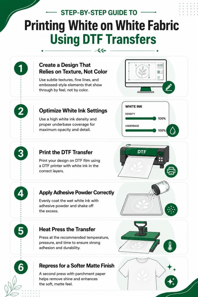
Step-by-Step Guide to Printing White on White Fabric Using DTF Transfers
1. Create a Design That Relies on Texture, Not Color
Do not use big, flat blocks of solid white. Your artwork must use thin lines and sharp angles. Focus on geometric layouts and tonal logos. Incorporate plenty of negative space into the graphic. This allows the shirt fabric to peak through. The contrast between raw fabric and smooth ink creates a premium, embossed look. This is the foundation of a great subtle white print shirt design.
2. Optimize White Ink Settings
Open your RIP software. Standard print jobs use maximum ink to block out dark fabrics. For white on white DTF printing, you must change this. Reduce the white ink density by 15% to 20%. Avoid building a thick underbase. Soften the outer edges of your graphic in your design program. This stops the white ink from pooling and creates a much smoother edge profile.
3. Print the DTF Transfer
Load your high-quality matte PET film into the printer. If you are running multiple minimalist logos or varying sizes simultaneously, utilizing a professional DTF gang sheet printing layout will maximize your film space. Run your print job using a modified CMYK plus white layer setup. Even though the design is white, using a tiny fraction of CMYK tint can help define the edges. Ensure your white channel setup is perfectly calibrated.
4. Apply Adhesive Powder Correctly
Apply your fine TPU adhesive powder immediately after printing while the ink is still wet. Shake off all excess powder thoroughly. Any leftover powder on the clear film will melt into small, shiny spots on the shirt background. This ruins the clean look of your DTF printing on white fabric.
5. Heat Press the Transfer
Preheat your garment for 5 seconds to remove moisture. Place your transfer film down onto the fabric. Set your heat press to 300°F to 320°F (150°C-160°C). Use medium, consistent pressure. Press the design for 12 to 15 seconds. Let the film cool completely before execution if you are using cold-peel film. Peel the plastic backing away in one smooth, low motion.
6. Repress for a Softer Matte Finish
Never skip the final press. Place a sheet of premium parchment paper or a silicone matte sheet directly over the fresh print. Press it one more time for 5 seconds using light pressure. This seals the ink into the fabric fibers, removes any remaining plastic gloss, and ensures an ultra-soft, retail-ready finish.
Techniques That Make White-on-White Designs More Visible
To make your prints pop, you must use creative styling tricks. These specialized DTF white ink printing techniques create visual contrast without using color.
Matte vs. Gloss Contrast
Use a matte shirt but press your design with a high-gloss finishing sheet. When the light hits the garment, the shiny print reflects light while the fabric absorbs it. This mismatch makes the artwork visible from across a room.
Raised Ink Effects
Print multiple layers of white ink directly on top of each other. This creates a raised, dimensional surface. The physical thickness creates tiny shadows around the edges of your text, making it look like an expensive molded emblem.
Micro-Texture Patterns
Do not print solid blocks. Fill your graphics with tiny micro-texture dots or fine grid lines. This variation breaks up the smooth ink surface, helping you avoid a flat look when printing white designs on white apparel.
Tonal Shadow Effects
Add a very light gray border—around 5% opacity—to one side of your white graphic. This creates a fake shadow effect. It mimics the look of a real embossed engraving and adds instant depth to your white on white DTF printing projects.
White-on-White DTF vs Screen Printing vs Embroidery
|
Feature |
White-on-White DTF |
Screen Printing |
Embroidery |
|
Detail level |
High |
Medium |
Medium |
|
Texture control |
High |
Medium |
Very High |
|
Small runs |
Excellent |
Poor |
Moderate |
|
Tonal effects |
Excellent |
Limited |
Strong |
|
Cost efficiency |
Strong |
Weak for low MOQ |
Expensive |
Conclusion
Mastering white on white DTF printing requires total design restraint. It is not about creating loud, flashy graphics. Instead, it is about celebrating subtle texture and physical depth.
Do not rely on bright colors to make a statement. Focus on how your ink interacts with natural light. We encourage you to start experimenting with your software settings today. Play with different layer opacities and sheet finishes.
By combining the right garments with advanced DTF white ink printing techniques, you can confidently create premium, high-end results every time you are printing white designs on white apparel.
For fashion labels launching full seasonal collections of this minimalist style, partnering with a high-capacity hub for bulk wholesale DTF printing ensures flawless consistency and lower production costs at scale.
FAQs
Can DTF print white on white shirts?
Yes. You can print white ink on white shirts. The process requires custom software adjustments to prevent the design from completely disappearing into the fabric background.
How do you make white DTF designs visible on white fabric?
Focus on texture and light. Use thin linework, open fonts, and negative spaces. You can also finish the print with a gloss sheet to make it reflect light differently than the matte garment.
Does white ink work on white cotton?
Yes. Smooth, tightly woven ringspun cotton works best. The fabric fibers hold the liquid white ink on top of the surface, keeping the outer edges of your graphic sharp.
What is monochrome DTF printing?
It is a single-color printing method. It uses different shades or thicknesses of just one ink color—like white ink on a white shirt—to create a subtle, premium look.
Is white-on-white DTF durable?
Yes. It lasts just as long as standard color transfers. Because the white ink layer is thinner, it actually stretches better and is less likely to crack after washing.
Should you use hot peel or cold peel for white ink DTF?
Cold-peel film is safer. Letting the transfer cool completely before peeling protects the delicate, thin edges of your white lettering from lifting up or tearing.
Why does white DTF sometimes look yellow?
Your heat press is too hot or you pressed it too long. High heat scorches the white ink or burns the adhesive powder underneath, turning the print a dull yellow.
How do you make DTF prints feel softer?
Lower your white ink density settings in your RIP software. After peeling the transfer film, always do a final 5-second press using premium parchment paper to soften the texture.