


In direct-to-film printing, the white underbase is a crucial layer that forms the foundation of your print. One bad underbase can ruin the entire print. Colors look dull. Edges bleed. The design just… falls flat.
That’s the reality many print shops face when they ignore or misconfigure the underbase in DTF printing, especially in custom DTF transfers. It’s not just a technical step. It’s the foundation of your print quality. Get it right—and your prints pop. Get it wrong—and nothing else can fix it.
If you’ve ever struggled with faded colors on dark garments or inconsistent prints, this is where you need to focus. In this blog, we are going to shed light on this essential and often overlooked process to help you create the best quality prints.
Let’s break it down.
What Is Underbase in DTF Printing?
In simple terms, the underbase is a layer of white ink printed beneath your design. It acts like a primer. Especially on dark fabrics. Without it, colors sink into the fabric. They lose brightness. Contrast disappears.
That’s why white DTF ink plays such a critical role. It creates a solid base so your colors sit on top, not inside the fabric. Think of it like painting a wall.
You don’t apply bright colors directly on a dark surface. You prime it first. Same idea here.
Why Underbase Matters More Than You Think
Let’s make this real.
Scenario 1:
You print a vibrant red design on a black t-shirt. No underbase.
Result? The red looks dull. Muddy. Almost brown. Not what you promised the client.
Scenario 2:
Same design. Proper underbase applied.
Now the red pops. Bright. Clean. Sharp. Exactly how it should look.
That’s the difference a proper base layer makes.
When learning how to create underbase for DTF printing, most people focus on the design. But the real impact comes from what sits beneath it. The DTF white underbase process is what gives your print life.
It directly controls:
-
Color vibrancy
-
Print sharpness
-
Wash durability
-
Overall finish
Even small changes in DTF underbase settings can shift your results from average to premium. Too little white, and colors fade. Too much, and prints feel heavy and crack over time.
Ignore the underbase, and you’re not just risking one print. You’re risking consistency, customer trust, and repeat business.
Also read: DTF Transfer Curing: What It Is and How It Affects Print Durability
How to Create Underbase for DTF Printing
Now let’s get practical. This is where most people get stuck when learning how to create underbase for DTF. It’s not just one setting. It’s a combination of steps that work together.
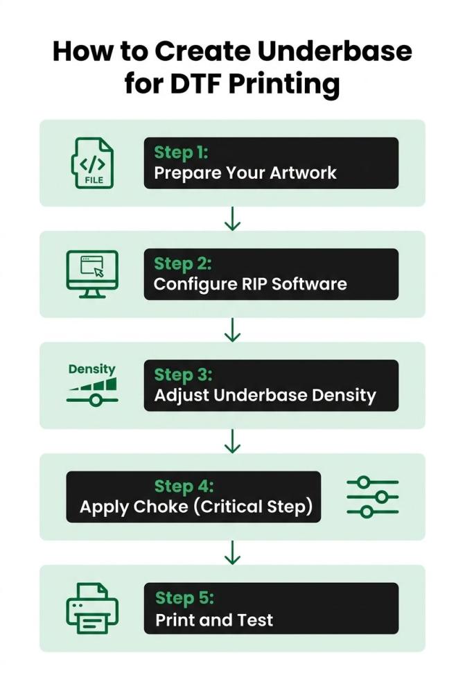
Step 1: Prepare Your Artwork
Everything starts here.
Your design must be clean. High resolution. Transparent background. Because in underbase in DTF printing, your RIP software doesn’t fix flaws—it copies them into the white layer.
Here’s the truth: bad artwork = bad underbase.
If your file has rough edges, your white DTF layer will reflect those edges. If gradients are messy, the base will look uneven.
Focus on:
-
Using 300 DPI images
-
Cleaning jagged edges
-
Removing shadows and noise
-
Simplifying gradients where needed
Think of your artwork as the blueprint for the DTF white underbase process. Every flaw gets printed first.
Step 2: Configure RIP Software
This is where DTF underbase settings come into play.
Your RIP software controls how the white layer behaves.
It decides:
-
Where white ink is applied
-
How thick the underbase is
-
How it aligns with color layers
Key settings to dial in:
-
White ink density
-
Choke (underbase shrink)
-
Feathering for smoother edges
If you’re working with bulk layouts or gang sheet printing, these settings become even more critical. One wrong configuration can affect multiple designs at once.
Step 3: Adjust Underbase Density
This step is all about balance.
Too much white ink? The print feels heavy. It may crack after washes.
Too little? Colors look faded and weak.
You need to find the sweet spot.
Most setups start with:
-
60%–80% density for regular prints
-
Slightly higher for dark garments
But don’t rely on presets alone. Every design behaves differently. Testing is key.
Step 4: Apply Choke (Critical Step)
Choke is small. But powerful.
It slightly reduces the size of the underbase compared to the color layer. This prevents white outlines from appearing around your design.
Even a tiny misalignment can ruin the final look.
Typical choke values:
-
0.1–0.3 mm
Without choke, your prints may look unprofessional—especially on detailed artwork.
Step 5: Print and Test
This is where everything comes together.
Never skip testing. Ever.
Run small samples and evaluate:
-
Color vibrancy
-
Edge sharpness
-
Fabric feel
Make adjustments based on results. Fine-tune your DTF underbase settings until the output looks clean and consistent.
Adjust based on results.
|
Factor |
What It Does |
Why It Matters |
|
Underbase Layer |
Adds white ink base |
Makes colors pop on dark fabrics |
|
White Ink Density |
Controls brightness |
Too high = heavy print, too low = dull colors |
|
Choke Setting |
Shrinks underbase slightly |
Prevents white edges from showing |
|
Artwork Quality |
Affects base accuracy |
Poor files = poor prints |
|
Testing |
Validates output |
Saves time and material long term |
Common Mistakes to Avoid
Let’s be honest. Most print failures come from small, avoidable mistakes—especially in the white underbase in DTF printing.
1. Ignoring White Ink Settings
Relying on default profiles is risky. Every design behaves differently, and poor settings often lead to uneven coverage or issues like white invaginate around edges.
2. Overusing White Ink
More white doesn’t mean better results. It makes prints feel thick, reduces flexibility, and often leads to cracking after a few washes—especially in high-volume or direct to film printing in bulk workflows.
3. Skipping Choke Settings
No choke? Expect visible white outlines. Even slight misalignment can make prints look cheap and unprofessional.
4. Poor Artwork Preparation
Messy files create messy underbases. Rough edges, noise, and bad gradients all show up in the final print—no matter how good your settings are.
Read more: What Makes a Good DTF Transfer
Understanding “White Invaginate” in DTF
You might have heard this term—white invaginate. Sounds technical. But it’s actually simple.
It refers to how the white underbase layer interacts with the color layer, especially around tight edges and fine details. When not controlled properly, the white ink can push outward or misalign slightly beneath the top colors.
Here’s what happens when it goes wrong:
-
White ink spreads beyond design edges
-
Fine details start to disappear
-
Edges look soft, blurry, or uneven
This is common in detailed artwork, small text, or complex graphics.
The good news? It’s fixable.
Proper choke settings help reduce the underbase slightly so it stays hidden beneath the color layer. Along with that, precise alignment in your RIP software ensures both layers sit perfectly on top of each other.
Get this right, and your prints look sharp. Ignore it, and even great designs lose their edge.
Advanced Tips for Better Underbase Control
If you want to move beyond average prints, this is where the real control begins. Small refinements here can dramatically improve your results.
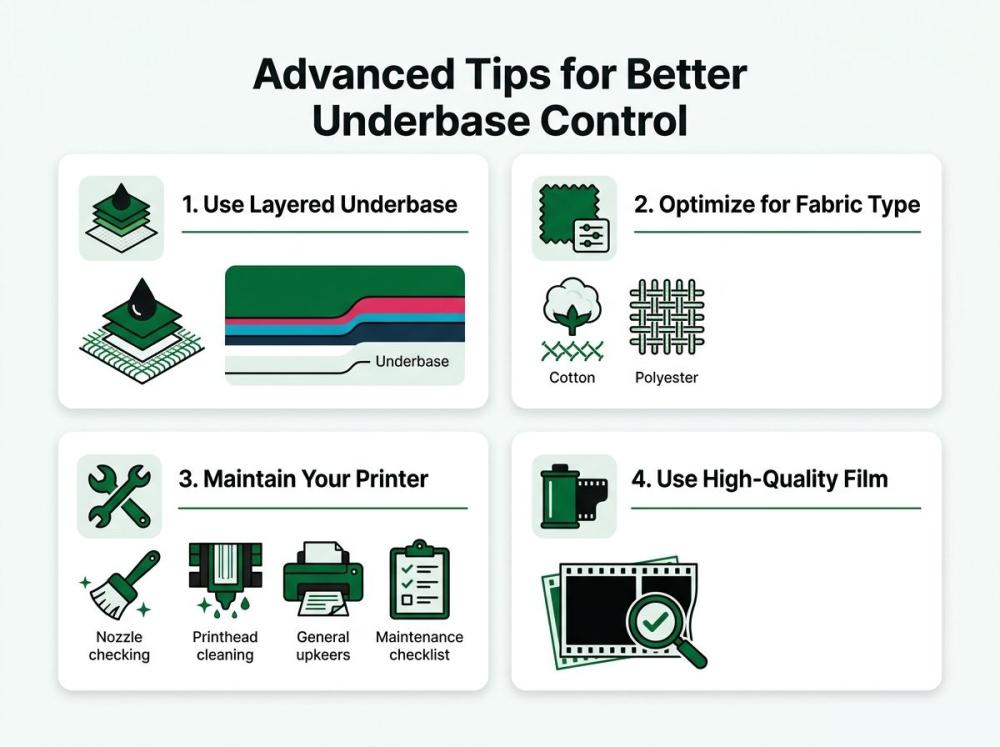
Use Layered Underbase
For complex or highly detailed designs, a single underbase layer may not be enough. Splitting it into layers allows better control over ink distribution, especially in gradients and fine details. It helps maintain clarity without overloading white ink.
Optimize for Fabric Type
Not all fabrics behave the same. Cotton absorbs ink differently than polyester. Blends react somewhere in between. Adjust your underbase density and curing approach based on the fabric to maintain consistency and durability.
Maintain Your Printer
White ink is sensitive. It clogs easily. If your printer isn’t maintained regularly, your underbase will come out uneven or patchy. Daily cleaning and proper ink circulation are essential for consistent output.
Use High-Quality Film
Film quality directly affects how the underbase sits and transfers. Cheap film can cause uneven adhesion or poor ink hold, leading to weak or inconsistent prints.
DTF Underbase vs Screen Printing Underbase
Quick comparison. Two different approaches. Same goal—strong, vibrant prints.
Screen printing relies on physical screens to lay down ink. Each color, including the base, requires a separate screen. The underbase is manually created and aligned, which takes time and precision.
DTF, on the other hand, uses digital control. The underbase in DTF printing is generated through software. No physical setup. No manual alignment. Just precise layering driven by settings.
Here’s where DTF stands out:
-
Detail: Fine lines, gradients, and small text come out sharper with white DTF because the underbase is digitally controlled.
-
Speed: No screen setup means faster turnaround, especially for short runs and custom orders.
-
Flexibility: You can switch designs instantly without rebuilding screens or adjusting physical setups.
But here’s the catch.
DTF only delivers these advantages if your underbase is set correctly. Poor settings can lead to dull colors, misalignment, or edge issues—problems screen printing has already solved over time.
So yes, DTF is more advanced. But control is everything.
Final Thoughts
Creating a solid underbase is not optional. It’s essential.
Every sharp print you’ve seen. Every vibrant design on a dark tee. It all comes down to how well the underbase in DTF printing is handled. That’s the foundation.
If you’re serious about learning how to create underbase for DTF printing, focus less on shortcuts and more on control. Settings matter. Testing matters. Consistency matters.
You don’t need expensive upgrades. You need precision in your white underbase in direct to film printing.
So next time a print looks off, don’t blame the machine. Look at your underbase.
FAQs
1. What is the ideal white ink percentage for DTF underbase?
Typically between 60%–80%, but it varies based on fabric type and design complexity.
2. Why does my DTF print look dull on dark garments?
This usually happens due to weak or improperly configured underbase settings.
3. Can I use the same underbase settings for all designs?
No. Each design requires adjustments based on colors, details, and fabric type.
4. How do I prevent white outlines around my design?
Apply proper choke settings to slightly shrink the underbase beneath the color layer.
5. Does underbase affect print durability?
Yes. A well-balanced underbase improves adhesion and helps prints last longer after washes.