
September 8, 2026 · Connor McDonnell
Common Color Separation Mistakes in DTF Printing
A great design does not always produce a great DTF transfer. Even artwork that looks perfect on your computer can print with dull colors, white halos, missing details, or unexpected color shifts.
The problem often starts during DTF color separation.
Color separation prepares artwork for the DTF printing process by determining how colors, transparency, and the white underbase will be printed. When these elements are not handled correctly, small digital mistakes can become obvious production problems.
Understanding common DTF color separation mistakes can help you improve print quality, reduce wasted transfers, and create more consistent results across different garments.
This guide explains the most common separation errors, how to troubleshoot them, and how to prepare artwork for a reliable DTF workflow.
What Is DTF Color Separation and Why Does It Matter?
DTF color separation is the process of preparing artwork so its colors and white underbase can be properly interpreted by the DTF printing workflow.
Unlike ordinary digital printing, DTF printing typically involves printing CMYK colors along with a white ink layer. The white layer provides a foundation for the colored inks, especially when the design is applied to dark or colored garments.
A typical DTF workflow looks something like this:
Artwork → Color processing → White underbase → RIP processing → Printing → Powder application → Curing → Heat pressing
Each stage affects the final result.
If the artwork has poor transparency, incorrect colors, weak edges, or an improperly generated underbase, the finished transfer may not match what you see on your screen.
How Color Separation Works in DTF Printing
During DTF printing color separation, the artwork is processed into information that the RIP software can use to control the different ink channels.
The process generally involves:
-
Processing the artwork's color information
-
Managing CMYK output
-
Creating the white underbase
-
Adjusting white choke
-
Handling transparency
-
Controlling ink coverage
-
Preparing the file for the specific printer and RIP workflow
The exact settings can vary between printers, RIP software, inks, films, and production environments.
That is why there is no single separation setting that works perfectly for every DTF setup.
Why the White Underbase Is So Important
The white underbase is one of the biggest differences between DTF printing and many standard printing workflows.
It sits underneath the colored ink and helps maintain color visibility on the garment.
If the white layer is too large, you may see white edges around the design. If it is too weak, colors can appear dull or less vibrant.
For a deeper look at this part of the process, see our guide on how to create underbase for DTF printing.
10 Common DTF Color Separation Mistakes That Affect Print Quality
Most DTF color separation problems can be traced back to a handful of artwork and production mistakes.
Here are the ones worth checking first.
1. Using RGB Artwork Without Proper Color Processing
RGB is designed primarily for displaying colors on screens. DTF printing, however, uses physical inks and a printer-specific color workflow.
A bright RGB red may look perfect on a monitor but produce a noticeably different result after printing.
That does not mean RGB artwork can never be used. It means the artwork needs to be processed correctly for the intended DTF workflow.
Before production, check:
-
The document's color settings
-
The intended print workflow
-
RIP software settings
-
The printer's color profile
-
Ink limitations
-
Expected garment color
Avoid judging print colors solely from your monitor.
2. Creating an Incorrect or Missing White Underbase
A weak or incorrectly generated white underbase can dramatically change the appearance of a DTF transfer.
On dark garments, insufficient white coverage may allow the garment color to influence the appearance of the CMYK layer.
This can make colors appear:
-
Dull
-
Grayish
-
Less saturated
-
Less consistent
On the other hand, excessive white coverage can make the design look heavy.
The goal is not simply to use as much white ink as possible. The white layer needs to work appropriately with the artwork, garment, and production settings.
3. Setting the White Choke Incorrectly
White choke slightly reduces the size of the white underbase beneath the colored artwork.
Its purpose is simple: help prevent the white layer from extending beyond the visible color layer.
Without enough choke, you may see a thin white border around letters, graphics, or other design elements.
Too much choke creates a different problem. It can reduce the white foundation beneath the color and cause tiny details to lose coverage.
The correct setting depends on your specific RIP software, printer, artwork, and workflow. Always test your settings instead of treating one value as universal.
4. Using Too Much or Too Little White Ink
White ink coverage directly influences how colors appear.
Too little white can result in weak or desaturated colors.
Too much white can contribute to a heavier appearance and may affect the overall feel of the print.
The right approach depends on factors such as:
-
Garment color
-
Artwork complexity
-
Gradients
-
Fine details
-
Printer capabilities
-
RIP settings
-
Ink characteristics
This is why white ink should be treated as part of the overall color-management process rather than as a separate step.
5. Ignoring Transparency in the Artwork
Transparency is another common source of DTF color separation errors.
Designs often contain semi-transparent shadows, fades, glows, gradients, and soft edges. If these elements are not processed correctly, the RIP software may interpret them differently than expected.
You may notice:
-
Missing faded areas
-
Hard edges where soft transitions were expected
-
Unwanted halos
-
Weak sections of the design
-
Blocky-looking gradients
Before sending artwork to production, inspect transparent areas carefully.
If you are preparing artwork from scratch, our guide on image for DTF printing can help you build a more print-ready file.
6. Creating Gaps or Unwanted Overlaps Between Colors
Small gaps between color areas may not be obvious when viewing artwork on a screen.
After printing, however, they can become visible.
Poor knockouts or incorrect overlaps can create:
-
Thin lines
-
Visible gaps
-
Uneven color transitions
-
Missing sections
-
Misaligned color areas
This becomes particularly important in detailed logos, small text, illustrations, and designs containing multiple adjacent colors.
Always inspect the artwork at a high zoom level before finalizing the separation.
7. Over-Saturating Colors to Make the Design Pop
It is tempting to increase saturation when preparing artwork for printing.
The problem is that a screen can display colors that physical inks cannot reproduce in exactly the same way.
Excessive saturation adjustments can lead to colors that look unnatural or muddy after printing.
Instead of simply pushing saturation higher, focus on:
-
Proper color management
-
Accurate profiles
-
Suitable ink limits
-
Appropriate RIP settings
-
Physical test prints
Your goal should be predictable color reproduction rather than the brightest possible color on screen.
8. Starting With Low-Resolution Artwork
Color separation cannot repair poor source artwork.
If the original image contains pixelated edges, insufficient detail, or blurry elements, those problems can remain visible after separation.
Low-resolution artwork may produce:
-
Jagged edges
-
Pixelation
-
Blurry text
-
Loss of fine details
-
Uneven curves
Whenever possible, start with high-quality artwork.
Vector artwork is particularly useful for logos and designs containing clean shapes or text. For raster artwork, use a sufficiently high-resolution source and inspect it at its intended print size.
9. Flattening Artwork Too Early
Flattening a design can make future adjustments much more difficult.
If everything is merged before the separation process is finalized, changing an individual color or modifying a shadow may require rebuilding part of the artwork.
Keeping editable layers can make it easier to adjust:
-
Individual colors
-
Highlights
-
Shadows
-
Gradients
-
Transparency
-
Background elements
-
White underbase requirements
Keep the editable master file until the design has been tested and approved.
10. Skipping a Test Print
One of the most expensive DTF color separation mistakes is assuming that the digital preview tells you everything.
It does not.
A design can look excellent on a monitor and still produce unexpected results when printed, powdered, cured, and pressed.
A test transfer allows you to evaluate:
-
Color accuracy
-
White coverage
-
Edge quality
-
Fine details
-
Transparency
-
Adhesion
-
Overall appearance
For larger production runs, a small test can prevent much larger material and labor losses.
How to Fix DTF Color Separation Problems Before Printing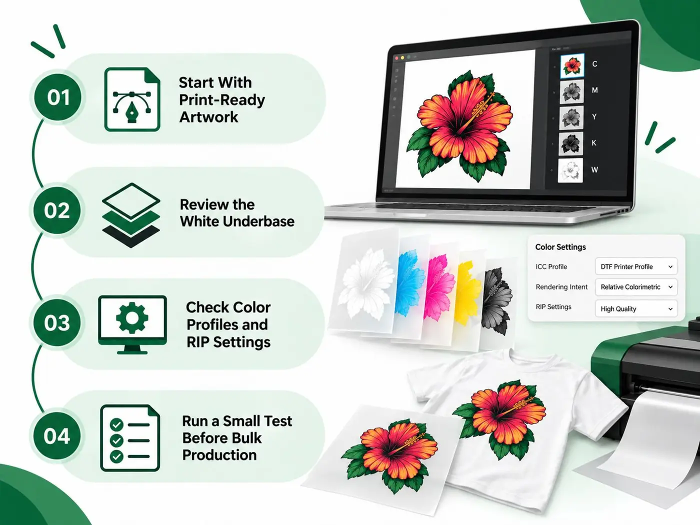
Once you identify a separation problem, the next step is to work backward through the artwork and production workflow.
Start With Print-Ready Artwork
Before working on separation, inspect the original file.
Check:
-
Resolution
-
Dimensions
-
Background removal
-
Edges
-
Transparency
-
Small details
-
Color settings
Do not wait until after printing to discover that the source artwork itself was the problem.
Review the White Underbase
Inspect the white layer independently when possible.
Look for areas where the underbase:
-
Extends beyond the artwork
-
Is missing
-
Covers areas that should remain transparent
-
Is too weak beneath important colors
-
Interferes with small details
The underbase should support the artwork rather than overpower it.
Check Color Profiles and RIP Settings
Your RIP software plays an important role in color separation for DTF printing.
Verify that the selected workflow matches your printer and ink setup.
Avoid changing multiple color settings at once. Make controlled adjustments and compare the results through test prints.
This makes it easier to identify what actually improved or harmed the output.
Inspect Edges, Gradients, and Transparent Areas
Zoom into the artwork before production.
Pay special attention to:
-
Fine outlines
-
Small text
-
Semi-transparent shadows
-
Gradients
-
Overlapping colors
-
Thin design elements
These areas are often where DTF color separation problems become visible first.
Run a Small Test Before Bulk Production
Testing becomes even more important when producing a large order.
Print a representative design and evaluate the finished transfer.
If the test reveals a color or separation problem, fix the artwork before producing the complete batch.
This simple step can save considerable amounts of film, ink, powder, garments, and production time.
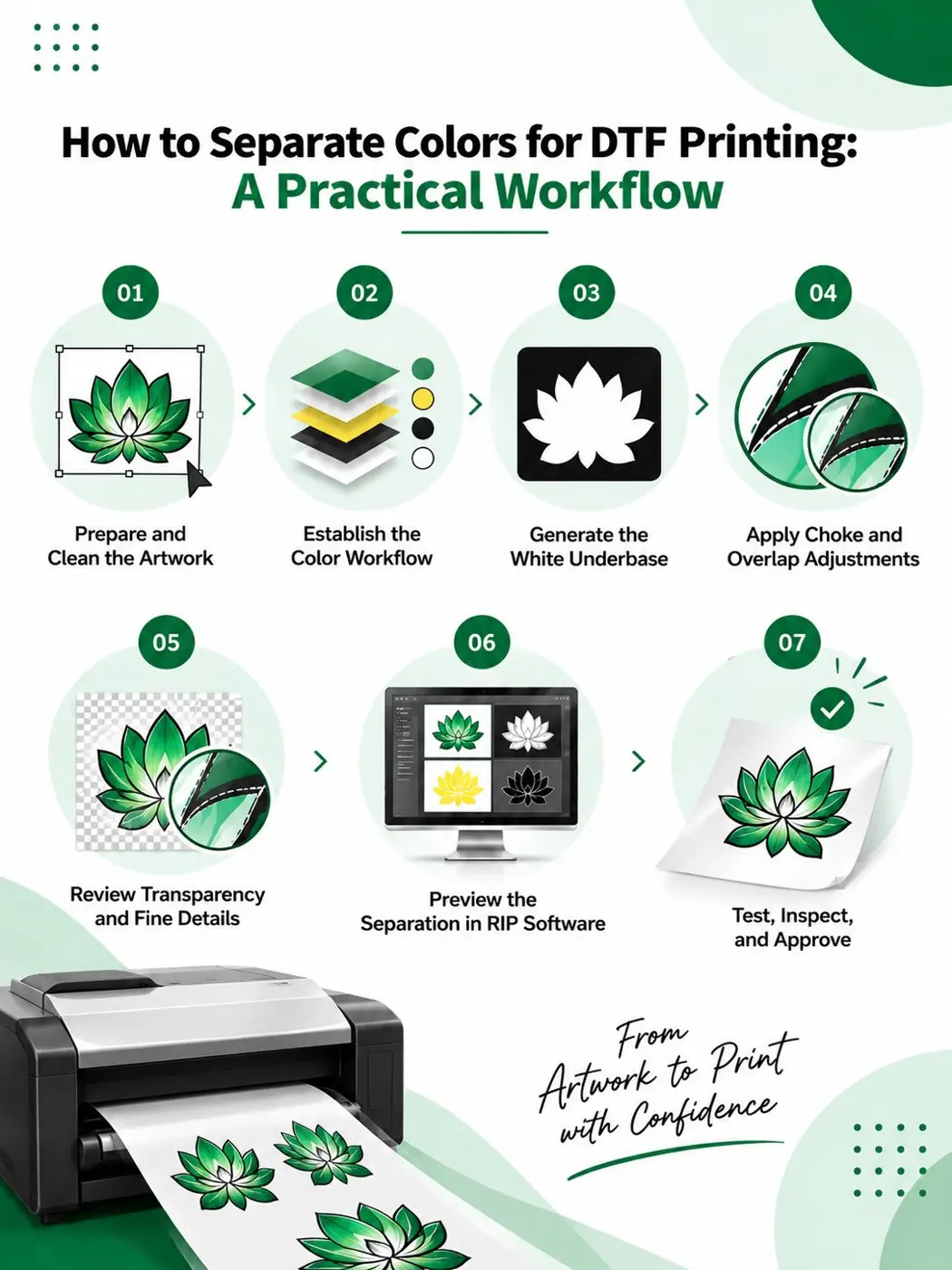
How to Separate Colors for DTF Printing: A Practical Workflow
If you are learning how to separate colors for DTF printing, use a repeatable workflow instead of adjusting settings randomly.
Step 1: Prepare and Clean the Artwork
Start with a high-quality file.
Remove unwanted backgrounds and inspect the design for unnecessary transparency, rough edges, and low-resolution elements.
Step 2: Establish the Color Workflow
Review the artwork's color settings and determine how the file will be processed by your RIP software.
Do not assume that colors displayed on your monitor will automatically reproduce exactly in print.
Step 3: Generate the White Underbase
Create the white layer according to the artwork, garment, printer, and RIP workflow.
Check the underbase carefully around detailed edges and transparent areas.
Step 4: Apply Choke and Overlap Adjustments
Review how the white layer sits beneath the colored artwork.
The objective is to reduce visible white edges without removing too much white coverage from the design.
Step 5: Review Transparency and Fine Details
Inspect faded edges, gradients, shadows, and small elements.
If a transparent effect is important to the design, make sure your RIP workflow handles it as intended.
Step 6: Preview the Separation in RIP Software
Use the RIP preview to inspect the processed artwork.
Look for:
-
White halos
-
Missing areas
-
Unexpected solid sections
-
Excessive white coverage
-
Color inconsistencies
-
Broken gradients
Step 7: Test, Inspect, and Approve
Print a sample before moving into full production.
Compare the physical transfer with the original artwork and document any adjustments that improve consistency.
DTF Color Separation Errors: Troubleshooting Guide
When a transfer does not look right, identifying the symptom can help narrow down the cause.
|
Problem |
Likely Cause |
What to Check |
|
White halo around design |
Incorrect white choke or underbase size |
White layer and choke settings |
|
Colors look dull |
Insufficient white coverage or color-management issue |
Underbase and RIP settings |
|
Colors look muddy |
Excessive ink or white coverage |
Ink limits and white density |
|
Unexpected color shift |
Color workflow mismatch |
Profiles and RIP settings |
|
Missing faded areas |
Transparency processing issue |
Alpha/transparency settings |
|
Jagged edges |
Low-resolution artwork |
Original file quality |
|
Gaps between colors |
Poor knockout or overlap |
Color boundaries |
|
Fine details disappear |
Excessive choke or weak artwork |
Underbase and source artwork |
|
Transfer differs from screen |
Monitor vs. physical color difference |
Color workflow and test print |
|
Results vary between jobs |
Inconsistent production settings |
RIP and printer workflow |
This approach is much more effective than changing random settings and hoping the next print looks better.
How DTF Color Separation Affects the Final Transfer
Good separation is important, but it is only one part of the DTF production process.
After the artwork has been separated, the transfer still needs to go through printing, adhesive powder application, curing, and heat pressing.
That means a design can have excellent separation and still experience problems elsewhere in production.
Why a Perfect Digital File Can Still Produce a Poor Transfer
The final appearance can be affected by:
-
Ink application
-
White ink coverage
-
Film quality
-
Adhesive powder
-
Curing
-
Heat
-
Pressure
-
Pressing time
-
Garment material
For example, a color problem visible in the artwork is different from an adhesion problem caused during application.
Understanding these differences helps you troubleshoot more efficiently.
Don't Confuse Separation Problems With Pressing Problems
Not every print defect originates in the artwork.
For example:
White outline: Often points toward an underbase or choke issue.
Dull colors: May involve white coverage or color management.
Poor adhesion: May require investigation of curing or pressing.
Fading after washing: Can involve transfer quality, curing, application, and washing conditions.
When troubleshooting, identify the stage where the problem first appears.
If the issue occurs during application, review your best temperature for DTF Printing and related pressing parameters.
A Pre-Production Checklist for DTF Color Separation
Before approving artwork for production, run through this quick checklist.
Artwork Checklist
-
Artwork has sufficient resolution
-
Design dimensions are correct
-
Unwanted backgrounds are removed
-
Edges have been inspected
-
Transparency has been reviewed
-
Small details are suitable for the intended print size
Separation Checklist
-
Color workflow has been reviewed
-
CMYK output has been checked
-
White underbase has been inspected
-
White choke has been reviewed
-
Color overlaps are clean
-
No unwanted gaps are present
-
Gradients and transparent areas have been checked
Production Checklist
-
Correct RIP settings are selected
-
Printer workflow is consistent
-
Test transfer has been produced
-
Transfer has been inspected
-
Pressing conditions are appropriate
-
Final sample has been approved before bulk production
A consistent checklist can turn color separation from a trial-and-error task into a repeatable production process.
When Should You Outsource DTF Printing Instead of Managing Separation In-House?
Managing DTF production in-house can make sense for established print shops with the right equipment, staff, and production volume.
But not every business needs to handle every stage of the process itself.
In-House DTF Printing May Make Sense When
You may benefit from an in-house workflow if you:
-
Already own DTF printing equipment
-
Have trained production staff
-
Produce transfers regularly
-
Need immediate production control
-
Have established color-management procedures
Outsourcing Can Be More Practical When
Outsourcing may be worth considering if you:
-
Do not own a DTF printer
-
Have limited production space
-
Struggle with color consistency
-
Need larger production capacity
-
Want to reduce equipment maintenance
-
Need to fulfill orders without managing the complete printing workflow
For businesses that need ready-to-use transfers, custom DTF transfers can simplify production by moving much of the printing process to an experienced transfer provider.
For multiple designs or larger quantities, DTF gang sheet printing can also help organize multiple transfers efficiently on a single sheet.
Businesses with recurring or high-volume requirements can explore bulk and wholesale DTF printing as their production needs grow.
And if you operate a brand or print business that wants fulfillment without emphasizing the production partner, a white label DTF printing service can provide another option.
The right choice ultimately depends on your order volume, equipment investment, turnaround requirements, and production goals.
Final Thoughts on Avoiding DTF Color Separation Mistakes
Successful DTF color separation is about more than simply converting an image into a printable format.
The white underbase, color workflow, transparency, choke, artwork quality, RIP settings, and physical production process all work together.
The most important habits are simple:
-
Start with quality artwork.
-
Use a consistent color workflow.
-
Inspect the white underbase.
-
Check white choke and overlaps.
-
Handle transparency carefully.
-
Avoid excessive color adjustments.
-
Test before large production runs.
-
Separate artwork problems from pressing problems.
When these steps become part of your regular workflow, you can reduce common DTF color separation mistakes and achieve more predictable transfers.
If managing artwork preparation, color separation, and production in-house is becoming difficult, outsourcing can also help you maintain consistency while focusing on your customers and growing your printing business.
Frequently Asked Questions About DTF Color Separation
What is DTF color separation?
DTF color separation is the process of preparing artwork for DTF production by managing its color information, white underbase, transparency, and other print-specific elements before the file is processed for printing.
What are the most common DTF color separation mistakes?
Common mistakes include incorrect white underbase settings, improper white choke, color-management issues, excessive saturation, transparency problems, poor overlaps, low-resolution artwork, and skipping test prints.
How do you separate colors for DTF printing?
A typical workflow involves preparing the artwork, establishing the appropriate color workflow, generating the white underbase, adjusting choke and overlaps, reviewing transparency, previewing the file in RIP software, and running a test print.
Why does my DTF transfer have a white outline?
A white outline can occur when the white underbase extends beyond the colored artwork. Incorrect choke or underbase settings are common areas to investigate.
Why do my DTF colors look dull after printing?
Dull colors may result from insufficient white coverage, color-management issues, incorrect RIP settings, or differences between screen colors and physical inks. Testing the complete workflow can help identify the cause.
Can RGB images be used for DTF printing?
RGB artwork can be part of the design workflow, but it must be processed appropriately for the DTF printer and RIP workflow. RGB colors displayed on a monitor may not reproduce exactly with physical inks.
How does the white underbase affect DTF colors?
The white underbase provides a foundation beneath CMYK inks. Its coverage can strongly influence color brightness, especially when the transfer is applied to dark or colored garments.
Can color separation fix low-resolution artwork?
No. Color separation cannot fully correct pixelation, jagged edges, or missing details caused by a poor-quality source file. Starting with high-quality artwork is essential.