


Why do your DTF transfer colors look different after pressing in print than on the screen? This is a common question that print shops and custom apparel businesses often face as a problem. It goes like this: You have prepared your design for DTF printing. The colors on your screen looked perfect — vivid, bold, exactly what your customer ordered. Then the DTF transfer came off the heat press, and something was just… off. The red is darker. The teal lost its punch. The neon yellow is now just yellow.
This isn't a printer error. It isn't a bad file. It's one of the most common challenges in DTF printing, and it comes down to a fundamental mismatch between how screens and printers produce color. Once you understand why it happens, you can start controlling it.
TL;DR
DTF print colors look different from your screen because screens produce color using emitted RGB light, while DTF printers reproduce color using physical CMYK ink. Ink can only reflect light; it cannot generate it, which makes printed colors inherently less saturated than what you see on a backlit display. A white ink underbase, fabric absorption, and heat press variables widen this gap further.
Why Actually Your DTF Transfer Colors Look Different on Screen
The reason is simple: screens and printers create color in completely different ways. They do not “see” color the same way. Understanding this is essential for improving DTF color accuracy and reducing unexpected print results.
Your screen uses the RGB color system — Red, Green, and Blue. It creates color using emitted light. Think of your monitor like a flashlight. The more light it emits, the brighter and more vibrant the colors appear. That’s why screens can display glowing neon shades, extremely bright blues, and highly saturated colors that instantly grab attention.
DTF printing, however, uses CMYK inks — Cyan, Magenta, Yellow, and Black. Instead of emitting light, printed ink reflects light. A print behaves more like a painted wall. It depends entirely on external lighting to show color. No glow. No self-illumination. Just reflected pigment sitting on fabric.
That difference changes everything.
Some RGB colors simply cannot exist in CMYK ink. This is called a color gamut limitation. Your monitor can display a much wider range of colors than a printer can physically reproduce. Neon greens, ultra-bright oranges, and electric blues are common examples. They look incredible on screen, but become softer once printed. This is one of the biggest reasons why DTF colors look different after pressing.
Think of it this way:
-
A screen creates color with light
-
A printer creates color with pigment
-
Light can appear more vibrant than ink ever can
This is the real reason behind many DTF transfer color issues.
Related: Understanding DPI vs PPI: What is the Right Resolution for DTF Printing?
Your DTF Printer Builds Color With Ink
A DTF printer works in an entirely different way. Instead of emitting light, it lays down physical ink onto a PET transfer film using a combination of Cyan, Magenta, Yellow, and Black — the CMYK color model. When you heat-press that transfer onto a garment, those ink layers bond to the fabric and sit on top of the fibers.
Here's the critical difference: ink does not glow. It absorbs certain wavelengths of light and reflects others back to your eyes. What you see as "red" on a printed shirt is the ink absorbing most of the light spectrum and reflecting only the red wavelengths. It's a passive process that depends entirely on the ambient light around you.
Because ink is a physical substance reflecting ambient light — rather than generating its own — printed colors will always appear more muted than their screen counterparts. They can absolutely be vibrant, rich, and beautiful. But they will never match the backlit luminosity you see on a monitor.
And this is not a DTF print quality issue unique to this technology. It applies to every print method in existence — screen printing, sublimation, offset printing, your office inkjet printer. The gap between RGB vs. CMYK for DTF printing — and for all printing — is a universal law of color science, not a manufacturing defect.
The Gamut Gap: Colors That Simply Cannot Be Printed
This is where DTF color management becomes especially important. The range of colors your screen can display is significantly larger than the range CMYK ink can reproduce. This difference is the root cause of most DTF artwork color adjustment headaches.
Think of it this way: RGB is a bigger room than CMYK. Some colors live comfortably inside both rooms. But many of the most vivid, electric colors — the ones that look stunning on screen — only exist in the RGB room. When your design file is sent to the printer, those out-of-gamut colors have to be translated into the closest printable equivalent that physically exists within CMYK's range.
That translation is handled automatically by RIP software (Raster Image Processor), which converts your RGB artwork into CMYK values before the file goes to print. The software does its best to find the nearest match — but it's always working with a smaller palette. The result? Neon colors become regular colors. Electric blues become standard blues. Luminous gradients flatten slightly.
The colors most likely to shift in this conversion — and the ones at the heart of most DTF printing color correction requests include:
-
Neon greens and yellows — among the furthest colors outside CMYK's reproducible range
-
Electric blues and purples — especially vivid, highly saturated shades
-
Bright reds and oranges — often print deeper and darker than the screen preview
-
Hot pinks and magentas — can shift toward a more muted rose or warm red
-
Very light pastels — can appear slightly heavier due to the white ink base layer beneath them
This does not mean your DTF prints will look bad. It means they will look like prints — physically grounded, real, and wearable — rather than like a glowing screen. The goal isn't to make your print match your monitor pixel for pixel. The goal is to understand the difference and design with it in mind from the start. That's exactly the mindset behind professional DTF color management.
Why This Matters More in DTF Than in Other Print Methods
DTF carries one additional variable that most other print technologies don't: the white ink underbase.
Because DTF transfers need to remain visible and vibrant on any fabric color — dark navy, jet black, bright red, or any pattern underneath — the printer lays down a layer of white ink beneath the color inks before the design is transferred to the garment. This white base is what makes your design pop on a black hoodie or a charcoal tee.
But that white layer also quietly changes how every color above it reads. Colors that appeared semi-transparent or softly blended on your digital canvas now sit on top of a fully opaque white surface.
The result:
-
Subtle gradients can feel slightly more defined and heavier
-
Soft skin tones can appear a touch more solid and saturated
-
Light pastels may read brighter on dark garments but heavier on light-colored fabrics
-
Mid-tone colors can shift slightly warmer or cooler depending on the white ink density
This isn't a defect — it's an inherent characteristic of the DTF process, and it's one that experienced designers actively factor into their DTF artwork color adjustment workflow from the moment they open a new file. If you're noticing this kind of shift across your orders, the solution isn't to chase a perfect match — it's to design files that account for the medium.
Working on a large run? If you're managing high-volume DTF orders and color consistency across batches matters to your brand, explore Bulk & Wholesale DTF Printing by DTFS — built for print shops and brands that can't afford inconsistent color across hundreds of garments.
How to Fix Dull DTF Prints — Starting With Your Design File
Understanding why this happens is the first step. But if you're actively dealing with dull or flat DTF print results, the first place to look is always your design file itself — specifically how it was prepared and what color space it was built in.
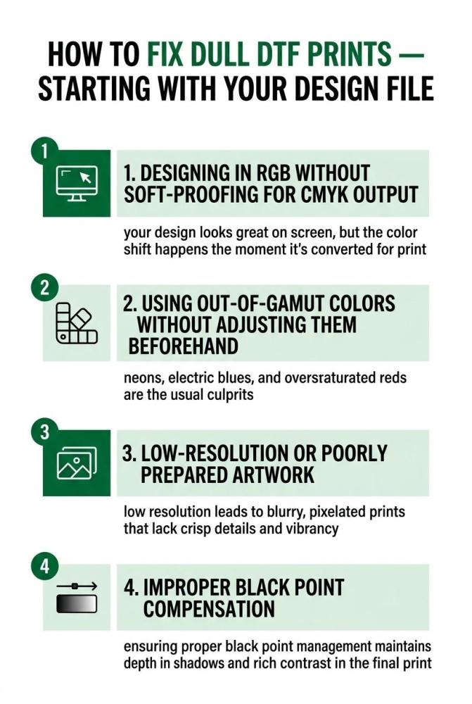
The most common file-level issues that lead to DTF print quality issues include:
-
Designing in RGB without soft-proofing for CMYK output — your design looks great on screen, but the color shift happens the moment it's converted for print
-
Using out-of-gamut colors without adjusting them beforehand — neons, electric blues, and oversaturated reds are the usual culprits
-
Low-resolution or poorly prepared artwork — compression artifacts and pixel degradation make color inconsistencies worse at the print stage
-
Transparency and blending mode issues — effects that look correct in design software may render differently once flattened for DTF output
A properly prepared, print-ready file eliminates a significant portion of DTF transfer color issues before they ever reach the printer. If you're unsure whether your artwork is set up correctly, DTFS's artwork setup and vectorization service can prepare your files specifically for DTF output — catching color and format issues that lead to reprints.
Related: How to Prepare Image for DTF Printing? An Expert’s Guide
Setting the Right Expectation (Before We Go Deeper)
None of this is a reason to lower your creative standards. It's a reason to calibrate your expectations to the medium you're printing on.
A professional photographer doesn't expect a printed photo to look identical to its appearance on an editing monitor. A graphic designer preparing a magazine layout doesn't expect Pantone spot colors to match their uncalibrated RGB screen preview. They understand the translation process, they build it into their workflow, and they produce work that looks excellent in its final physical form — not just on a screen.
DTF printing color correction is no different. Once you accept that your monitor is a reference tool — a starting point — rather than an exact print preview, you gain something genuinely useful: control. You can start making smarter decisions about color selection, file preparation, and design choices that consistently produce better results off the heat press.
In the sections ahead, we'll break down every specific cause of why DTF colors look different from your design — from ICC profiles and RIP settings, to fabric type, heat press temperature, environmental conditions, and more. We'll also give you a step-by-step DTF printing color correction workflow you can apply to your next job.
If you want consistent, vibrant, accurate results across every transfer — whether you're pressing a single custom piece or managing a gang sheet for a large run — understanding the science in this section is where that journey starts.
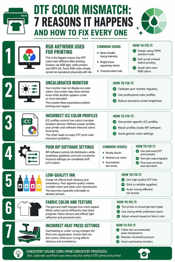
DTF Color Mismatch: 7 Reasons It Happens and How to Fix Every One
DTF color mismatch is one of the most common frustrations in direct-to-film printing. Your design looks bright and vibrant on screen, but the final transfer appears darker, duller, oversaturated, or simply “off.” In most cases, this is not caused by one single issue. Multiple factors affect how colors move from screen to film and finally onto fabric.
The good news? Most DTF transfer color issues are fixable once you understand the real cause behind them.
1. RGB Artwork Used for Printing
This is the biggest reason why DTF colors look different after printing. Screens use RGB light, while printers use CMYK ink. Some RGB colors simply cannot be reproduced physically with ink.
Common signs:
-
Neon shades losing intensity
-
Bright blues appearing darker
-
Oversaturated reds
How to fix it:
-
Design using CMYK preview mode
-
Soft-proof artwork before printing
-
Avoid ultra-neon RGB colors
2. Uncalibrated Monitor
Your monitor may not display accurate colors. One screen may show warmer tones while another appears cooler or more saturated.
This creates false expectations before printing even begins.
How to fix it:
-
Calibrate your monitor regularly
-
Use professional color profiles
-
Reduce excessive screen brightness
3. Incorrect ICC Color Profiles
ICC profiles control how colors translate between devices. Without proper profiles, your printer and software interpret colors incorrectly.
This often leads to major DTF print color mismatch problems.
How to fix it:
-
Use printer-specific ICC profiles
-
Match profiles inside RIP software
-
Avoid generic color settings
4. Poor RIP Software Settings
RIP software controls ink distribution, white underbase, gradients, and color conversion. Incorrect settings can completely shift print output.
Common issues include:
-
Muddy blacks
-
Washed-out colors
-
Inconsistent skin tones
How to fix it:
-
Use optimized DTF print presets
-
Test color output regularly
-
Fine-tune ink limits and saturation
5. Low-Quality Ink
Cheap ink affects both vibrancy and consistency. Poor pigment quality creates unstable colors and weak color reproduction.
This becomes especially noticeable on detailed artwork.
How to fix it:
-
Use high-quality DTF inks
-
Stick to reliable suppliers
-
Avoid mixing different ink brands
6. Fabric Color and Texture
The garment itself changes how colors appear. White cotton prints differently than black polyester. Fabric texture also affects light reflection and perceived color.
How to fix it:
-
Test prints on actual garment types
-
Use strong white underbase layers
-
Adjust artwork based on fabric color
7. Incorrect Heat Press Settings
Overheating or under-curing changes the final color appearance. Excess heat can dull colors, while poor curing affects vibrancy and consistency.
How to fix it:
-
Follow the recommended press temperature
-
Maintain consistent pressure
-
Avoid overheating transfers
Related: DTF Transfer Resolution Guide: Ideal DPI & Image Size for Perfect Prints
To Wrap Up
Getting accurate DTF print colors is not just about using a good printer. It’s about understanding how color behaves across your entire workflow — from artwork preparation to printing and pressing. Most DTF print quality issues happen because of mismatched color systems, incorrect profiles, poor artwork settings, or inconsistent production conditions.
The good news is that most color problems are predictable and fixable. Proper monitor calibration, high-quality inks, correct RIP settings, and smart DTF artwork color adjustment can dramatically improve print consistency and color accuracy.
Once you understand why DTF colors shift between screen and fabric, you can prepare designs more effectively and reduce wasted prints. Better color control leads to sharper branding, cleaner transfers, and more professional-looking garments every single time.
FAQs
Why do DTF colors look different after printing?
DTF colors often look different because screens use RGB light while printers use CMYK ink. Some bright screen colors cannot be reproduced exactly in print, causing visible color shifts.
How can I improve DTF color accuracy?
You can improve DTF color accuracy by calibrating your monitor, using correct ICC profiles, maintaining proper RIP software settings, and printing with high-quality inks and films.
Does fabric color affect DTF print colors?
Yes. Fabric color and texture significantly affect how printed colors appear. Dark garments, textured fabrics, and synthetic materials can change brightness, contrast, and saturation.
Why do my DTF prints look dull compared to the screen?
Screens emit light, making colors appear brighter and more vibrant. Printed ink reflects light, which naturally creates softer and less saturated colors compared to digital displays.
Can incorrect heat press settings change print colors?
Yes. Overheating or under-curing transfers can affect vibrancy, saturation, and overall color consistency, leading to visible DTF print quality issues.